시작에 앞서 CSS를 적용할 대상을 만들어줍니다.
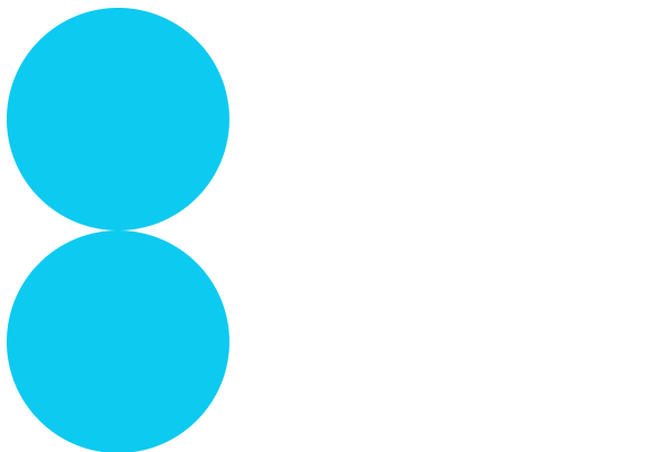
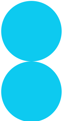
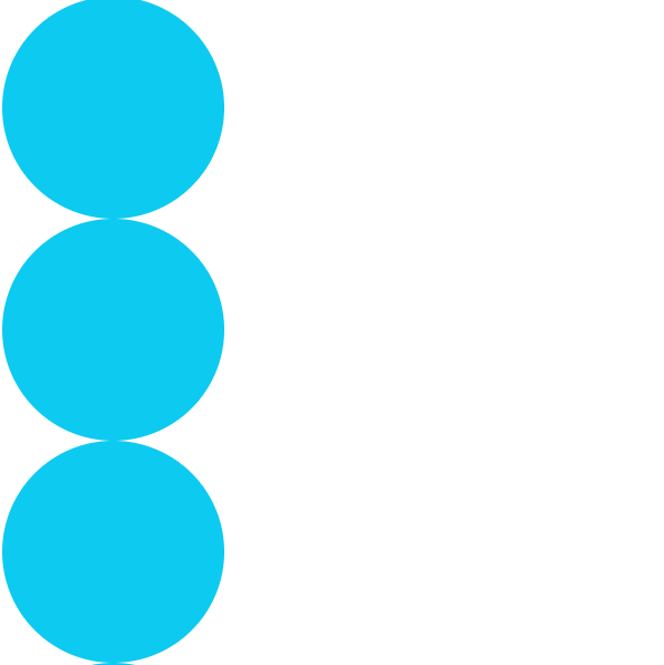
<div id="ball1" class="ball"></div>
<div id="ball2" class="ball"></div>
<div id="ball3" class="ball"></div>
<div id="ball4" class="ball"></div>
.ball {
width: 200px;
height: 200px;
background-color: skyblue;
border-radius: 50%;
}
애니메이션
1. 애니메이션 제작하기
먼저 @keyframes로 애니메이션을 만들어봅시다.
@keyframes colorChange {
    from {background-color: #0dcaf0;}
    to {background-color: #0a53be;}
}

@keyframes colorChangeAdvanced {
    0% {background-color: #0dcaf0;}
    25% {background-color: #3cb3ff;}
    50% {background-color: #4e69ff;}
    100% {background-color: #0a53be;}
}
colorChange 는 from에서 시작 상태를 지정하고 to에서 종료 상태를 지정합니다.
colorChangeAdvanced 는 전체 애니메이션 시간을 백분율로 나누어 좀 더 세부적인 상태를 지정할 수 있습니다.
2. 애니메이션 적용하기
아까 만들어두었던 공들에 1번에서 만든 애니메이션을 적용해보겠습니다.
animation-name 의 값으로 @keyframes의 이름을 넣어주기만 하면 됩니다.
#ball1 {
    animation-name: colorChange;
}

#ball2 {
    animation-name: colorChangePercentage;
}
참 쉽죠?
3. 재생시간 설정하기
animation-duration 은 애니메이션이 1회 재생될 시간을 조절해줍니다.
#ball1 {
    animation-name: colorChangePercentage;
    animation-duration: 2s;
}

#ball2 {
    animation-name: colorChangePercentage;
    animation-duration: 5s;
}
시간을 늘릴수록 색의 변화를 자세히 관찰할 수 있습니다.
4. 딜레이 설정하기
animation-delay 로는 애니메이션이 시작되는 시간을 조절할 수 있습니다.
색상 변화는 이제 지겨우니까 공을 좀 굴려보도록 하겠습니다.
@keyframes moveRight {
    from {margin-left: 0px;}
    to {margin-left: 200px;}
}
.ball {
animation-name: moveRight;
animation-duration: 3s;
}
#ball1 {
}
#ball2 {
animation-delay: 1s;
}
#ball3 {
animation-delay: -1s;
}
1번 공은 정상적으로 3초간 이동을 합니다.
2번 공은 1초 동안 기다렸다가 3초간 이동을 합니다.
animation-delay 값을 음수로 줄 경우 애니메이션을 스킵할 수 있습니다.
3번 공은 애니메이션이 1초간 진행된 상태로 순간 이동한 뒤 나머지 2초 동안 이동을 합니다.
결승점을 통과하는 순서는 3번(2초) - 1번(3초) - 2번(4초) 순입니다.
5. 실행 횟수
애니메이션을 반복할 횟수를 설정해줄 수 있습니다. 기본값은 1입니다.
#ball1 {
    animation-iteration-count: 3;
}

#ball2 {
    animation-iteration-count: infinite;
}
6. 재생 방향
normal 은 기본값이며, 애니메이션이 정상적으로 재생됩니다.
reverse 는 애니메이션이 반대로 재생되게 합니다. 즉 뒤로감기 입니다.
alternate 는 정상 재생한 후에 다시 reverse로 재생합니다.
alternate-reverse 는 먼저 reverse 한 후에 다시 정상 재생을 합니다.
#ball1 {
animation-direction: normal;
}
#ball2 {
animation-direction: reverse;
}
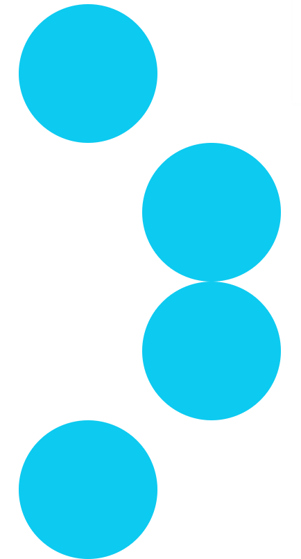
#ball3 {
animation-direction: alternate;
}
#ball4 {
animation-direction: alternate-reverse;
}
7. 절묘한 속도조절
animation-timing-function 으로 애니메이션의 완급 조절을 할 수 있습니다.
1번 공은 정속 주행을 합니다. (linear)
2번 공은 천천히 시작해서 갑자기 빨라졌다가 다시 느려집니다 (ease)
linear가 아니라 ease가 기본값입니다.
3번 이후부터는 그놈이 그 놈 같고 헷갈리기 시작합니다.
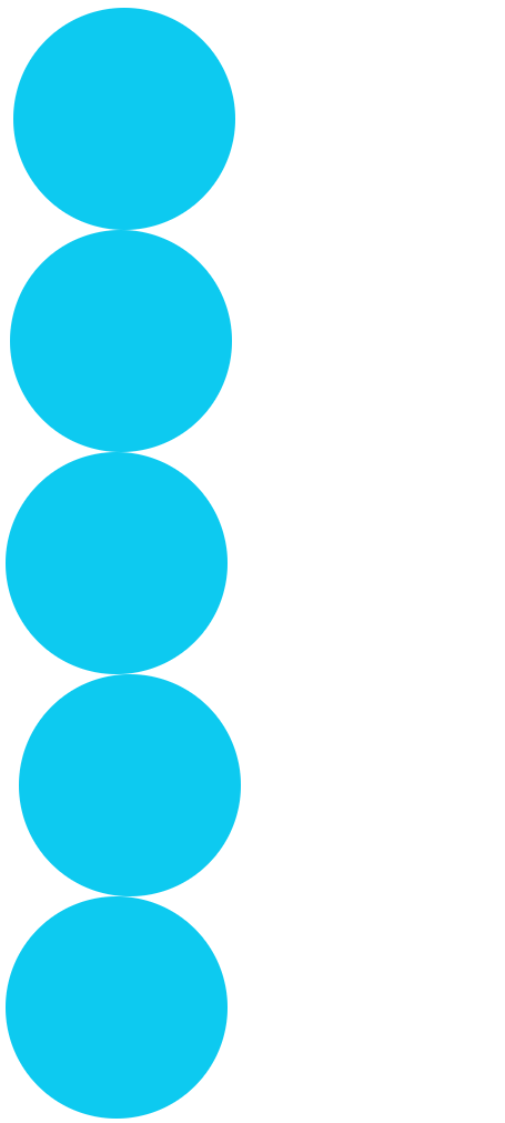
#ball1 {
    animation-timing-function: linear;
}
#ball2 {
    animation-timing-function: ease;
}
#ball3 {
    animation-timing-function: ease-in;
}
#ball4 {
    animation-timing-function: ease-out;
}
#ball5 {
    animation-timing-function: ease-in-out;
}
이렇게 물리 시간에 자주 보던 v-t 그래프로 나타내 보면 좀 더 직관적으로 알 수 있습니다.
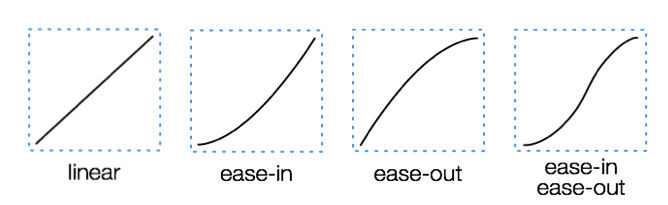
구별이 되시나요? 사실 ease 아래의 친구들은 자주 볼 일이 없을 것 같다는 생각이 들긴 합니다.
베지어 곡선을 이용해 자기만의 타이밍 함수를 만들 수도 있습니다.
linear를 베지어 곡선으로 표현하면 cubic-bezier(0.25, 0.25, 0.75, 0.75)라고 하네요.
그러니까 animation-timing-function: cubic-bezier(0.74, 0.23, 0.64, 0.55); 이런 식으로 맘대로 만들어서 쓸 수가 있다는 거죠.
뭔가 복잡해 보여서 구체적인 사용방법은 나중에 필요할 때 알아보도록 하겠습니다... :)
8. 상태를 유지하는 방법
애니메이션이 끝난 뒤에는 다시 처음의 상태로 되돌아가게 됩니다.
애니메이션이 시작되기 전 또는 종료된 이후의 상태는
animation-fill-mode 로 지정해줄 수 있습니다.
#ball0 {
    animation-fill-mode: none;
}

#ball1 {
    animation-fill-mode: forwards;
}

#ball2 {
    animation-fill-mode: backwards;
}

#ball3 {
    animation-fill-mode: both;
}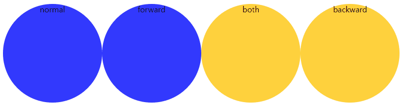
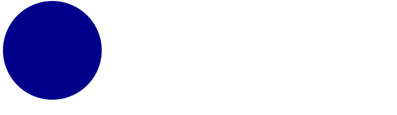
공들의 원래 색깔은 파랑입니다.
노랑에서 빨강으로 변하는 애니메이션을 적용했습니다.
① none인 경우(기본값)
파랑에서 시작해 노랑부터 빨강까지 변화한 뒤 다시 파랑으로 돌아갑니다.
② forwards인 경우
파랑으로 시작해 노랑부터 빨강까지 변화한 뒤 마지막 키프레임인 빨강으로 유지됩니다.
③ both인 경우
최초의 키프레임이 노랑이므로 그 값을 가져옵니다. (backwards와 같음)
노랑부터 빨강까지 변화하고 빨강으로 유지됩니다. (forwards와 같음)
④ backwards인 경우
노랑으로 시작해 노랑부터 빨강까지 변화한 뒤 다시 파랑으로 돌아갑니다.
9. 축약형으로 간단하게 쓰기
이상으로 animation의 속성들에 대해서 살펴봤습니다.
div {
    animation-name: moveRight;
    animation-duration: 3s;
    animation-timing-function: linear;
    animation-delay: 2s;
    animation-iteration-count: 2;
    animation-direction: normal;
}
이것들은 다음과 같이 한 줄로 간단하게 표현할 수 있습니다.
div {
    animation: moveRight 3s linear 2s 2 normal;
}
10. 재생 상태
animation-play-state 로는 애니메이션의 재생 여부를 설정해줄 수 있습니다.
div1 {
    animation-play-state: paused;
}
div2 {
    animation-play-state: running;
}
트랜지션
트랜지션은 애니메이션과 유사하게 속성을 스무스하게 변화시켜줍니다.
#ball1 {
    position: relative;
    transition-property: width, height;
    transition-duration: 4s;
}

#ball1:hover {
    height: 300px;
    width: 300px;
}
사용법상 애니메이션과 다른 점은 트랜지션이 적용될 transition-property 를 지정해줘야 한다는 것입니다.
한편 duration이나 timing-function, delay의 개념은 앞서 본 애니메이션과 동일하게 적용됩니다.
div {
    transition-property: width;
    transition-duration: 3s;
    transition-timing-function: linear;
    transition-delay: 2s;
}
는
div {
    transition: width 3s linear 2s
}
로 줄일 수 있습니다.
애니메이션과 트랜지션의 차이점
애니메이션 트랜지션은 모두 속성의 변화를 시각화하는 기능이라는 점에서 동일하지만
애니메이션은 중간 단계가 있어서 보다 다양하고 복잡한 일련의 변화를 보여줄 수 있습니다.
반면, 트랜지션은 초기상태와 최종상태만을 지정할 수 있습니다.
애니메이션은 페이지가 로드될 때 자동실행될 수 있고 지정한 횟수만큼 무한히 반복될 수 있지만
트랜지션은 트리거에 의해서 실행되며 트리거가 제거되면 다시 원래대로 돌아가게 됩니다.
즉, 달에 마우스 포인터를 올려놓으면(트리거) 달이 커지고 포인터를 치우면 달은 다시 작아지게 되는 거지요.
이런 특성 때문에 트랜지션은 자바스크립트와 함께 쓰기에는 좋다고 합니다.
참고 : https://blog.hubspot.com/website/css-transition-vs-animation
'Front-end' 카테고리의 다른 글
| HTML 기본 구조와 태그(tag), 요소(element), 속성(attribute) (0) | 2023.01.19 |
|---|---|
| submit 버튼 쓰지 않고 submit하기 (0) | 2023.01.12 |
| SASS (0) | 2021.05.13 |
| CSS로 반응형 웹 디자인하기 (0) | 2021.05.12 |
| CSS (0) | 2021.05.12 |


댓글